How to build a 3 column layout with gutenberg Block editor that is mobile-friendly.
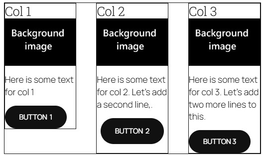
When you build a 3-column layout you have 3 columns within a parent column container. Notice that I gave each column a border. Columns don’t give you the option to stretch the column to take up 100% height of its parent container, so if you look at the image below you can see that column 1 is not taking up the full space of its parent container. Only stacks allow this, option, not columns. Also If you place the blocks (Header, image, paragraph, button) within each Column. You cannot push the button to the bottom if
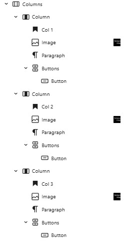
Solution Add a stack
- You have 3 columns winin a parent column container.
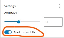
- Set outermost parent column to “Stack on mobile” This way each column will stack on top of the other on a mobile device instead of having each column side by side.
-
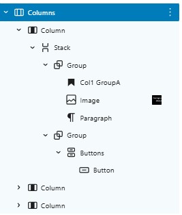
- within each column you have 1 stack.
- Stack settings:
- set minimum height to 100% so it fills the parent column height 100%
- Change vertical alignment to “space between”
- Stack settings:
- Within the stack you have 2 groups
- Button group
- Justify Center:
- The button group: Set bottom margin which lifts it up from the bottom.
- Button group
Col1 GroupA

Paragraph text col 1 groupA
Col2 GroupC

Paragraph text col 2 Group C . Contains an extra line.
Col3 Group E

Paragraph text col 3 stack E.. This has two or three extra lines taking up more space.
That’s how you use Columns and Stacks to create evenly spaced buttons / other block elements inside a column container.