WordPress Template Hierarchy
Every Template in wordpress has a corresponding php file. I have added the php files that each template uses. Below is a table with further explanations for each template.
| WP Template Name | Corresponding php file | Description of php file. |
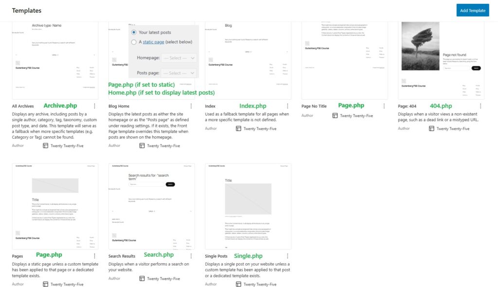
| All archives | archive.php | IIf you do not have a category–specific template (category.php) or tag-specific template (tag.php), WordPress will fall back to the general archive template: archive.php. Example You have a navigation menu with 3 categories:ProteinsDietFats When a user clicks on any of these, WordPress loads the corresponding category archive page. If there is:No category-{slug}.phpNo category.php Then WordPress will use:archive.php |
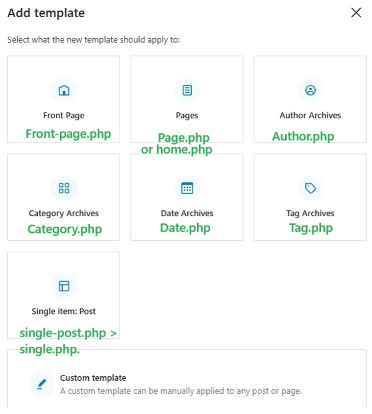
| Author archives | author.php | |
| Category archives | Category.php The hierarchy for Categories: .1) category-{slug}.php e.g., category-news.php2)category-{id}.php e.g., category7.php 3)Category.php 4) Archive.php 5) index.php | |
| Date archives | date.php | |
| Tag Archives | tag.php | |
| Blog home | 1. If your homepage display is set to Static page as homepage + post page is set as homepage + post 1)Home.php 2) index.php 2. If your homepage displays is set to “A static page”:Homepage (the page set as “Homepage”): 1) front-page.php → if it exists 2) else page-{slug}.php or page-{id}.php 3) else page.php 4) else index.php | Home.php is used for the homepage if front-page.php and if your reading-settings are set to latest posts  Or if your reading settings are set to “A static page” + “posts page”  |
| Front Page | front-page.php | front-page.php is only used if a static homepage is selected. It is never used when “Your latest posts” is selected.It’s never used for normal pages that are not a static homepage.  |
| Pages | For a normal page that is not set to static homepage: this is the hierarchy 1)Page-{slug}.php 2) Page-{id}.php 3)Page.php 4)index.php Template hierarchy: if a page is set to a static page + home page. This is the hierarchy 1)Front-page.php 2)page-{slug}.php (e.g., page-home.php) 3) Page-{id}.php 4) page.php 5) Index.php If a homepage is set to show your latest posts wordpress does not treat it as a page and this will be the hierarchy 1) Home.php 2) index.php | Used for all wordpress pages. If the Page is set as a static Homepage, then front-page.php gets top priority. If it’s just a normal Page (not the homepage), front-page.php is ignored. If the Page is set as a static Homepage but no front-page.php exists then the homepage is likely rendered by page.php |
| Pages no title | page.php | |
| index.php | index.php | If no php files exist for all the other templates (page.php, home.php , archive.php etc) they all default to index.php and the wordpress post, page, archive page etc will all display content based on what index.php tells it to do. |
| search | search.php | |
| Single Post | Single.php Single post hierarchy 1) Single-post-{slug}.php e.g., single-post-how-to-code.php (❗Rarely used — must be created manually) 2) Single-post.php Template for all single post entries (not pages or CPTs) 3) Single.php General fallback for any single post or custom post type 4) Singular.php General fallback for all singular content (posts, pages, CPTs) 5) index.php Final fallback | This is used for each of your posts. When you click a post it uses the Single posts template. |
| Single item: post | Single-post.php Single.php | |
| Page: 404 | 404.php |
